Suburban Symphony Orchestra
Logo redesign and marketing materials for Suburban Symphony Orchestra’s concert season.
Design Brief
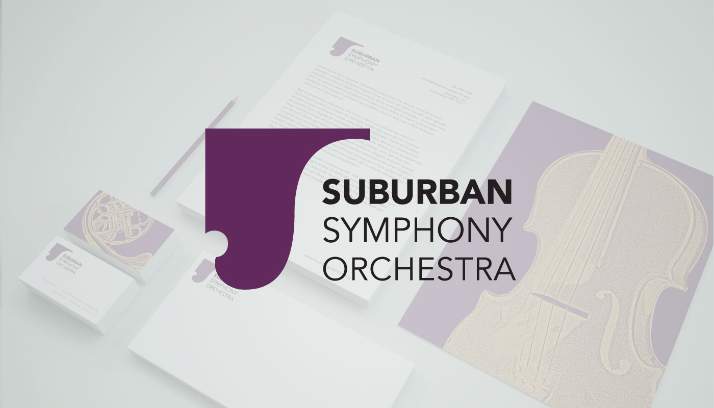
The Suburban Symphony, one of Cleveland’s premiere community orchestras needed a new logo design for use on their print and online marketing materials. They wanted a graphic/type logo combination that would work well in multiple sizes, large and small including apparel. It also need to be designed for horizontal or vertical use so that it can work well in different locations. The logo needed to be simple, elegant and represent classical music.
Solution
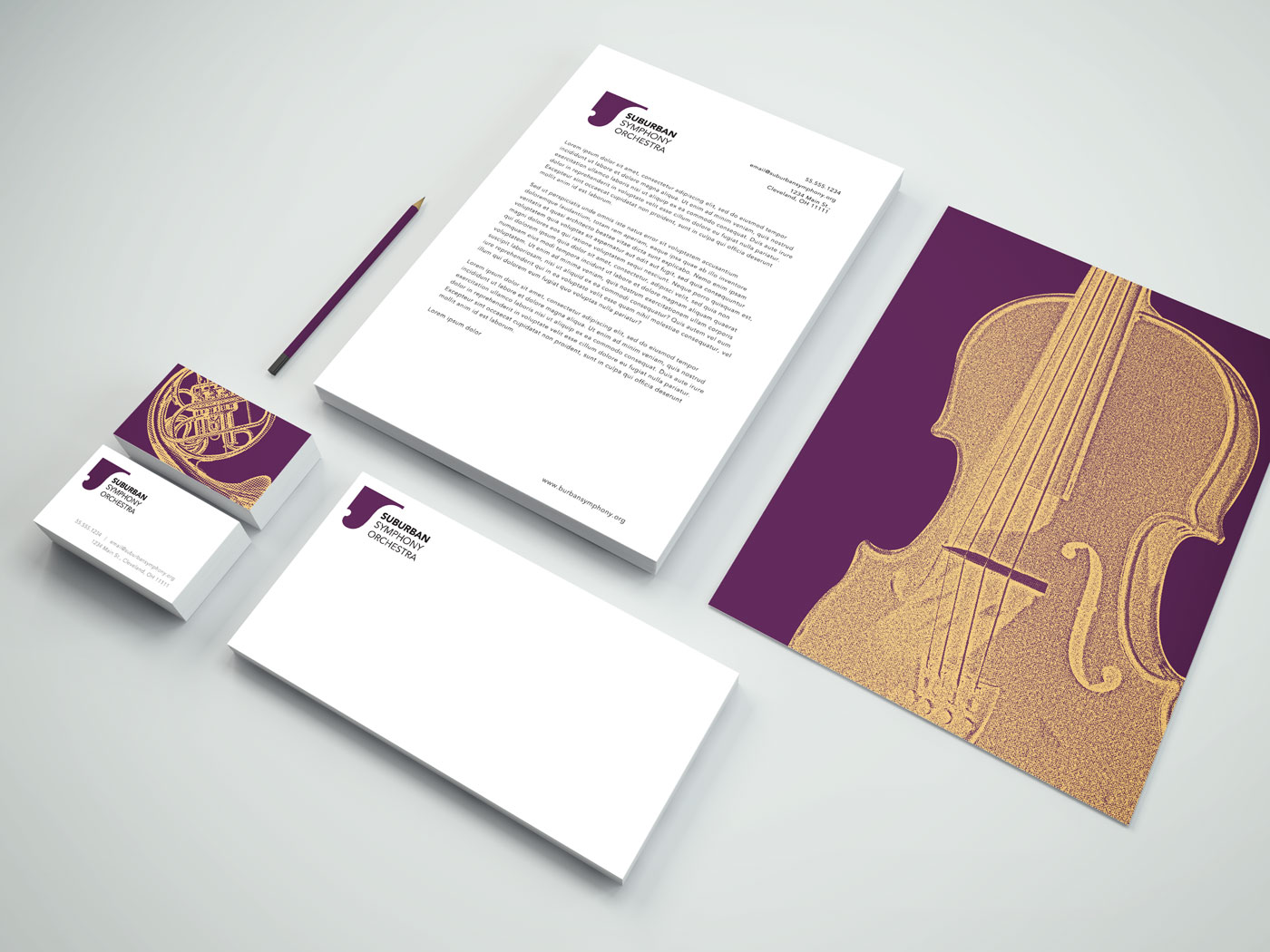
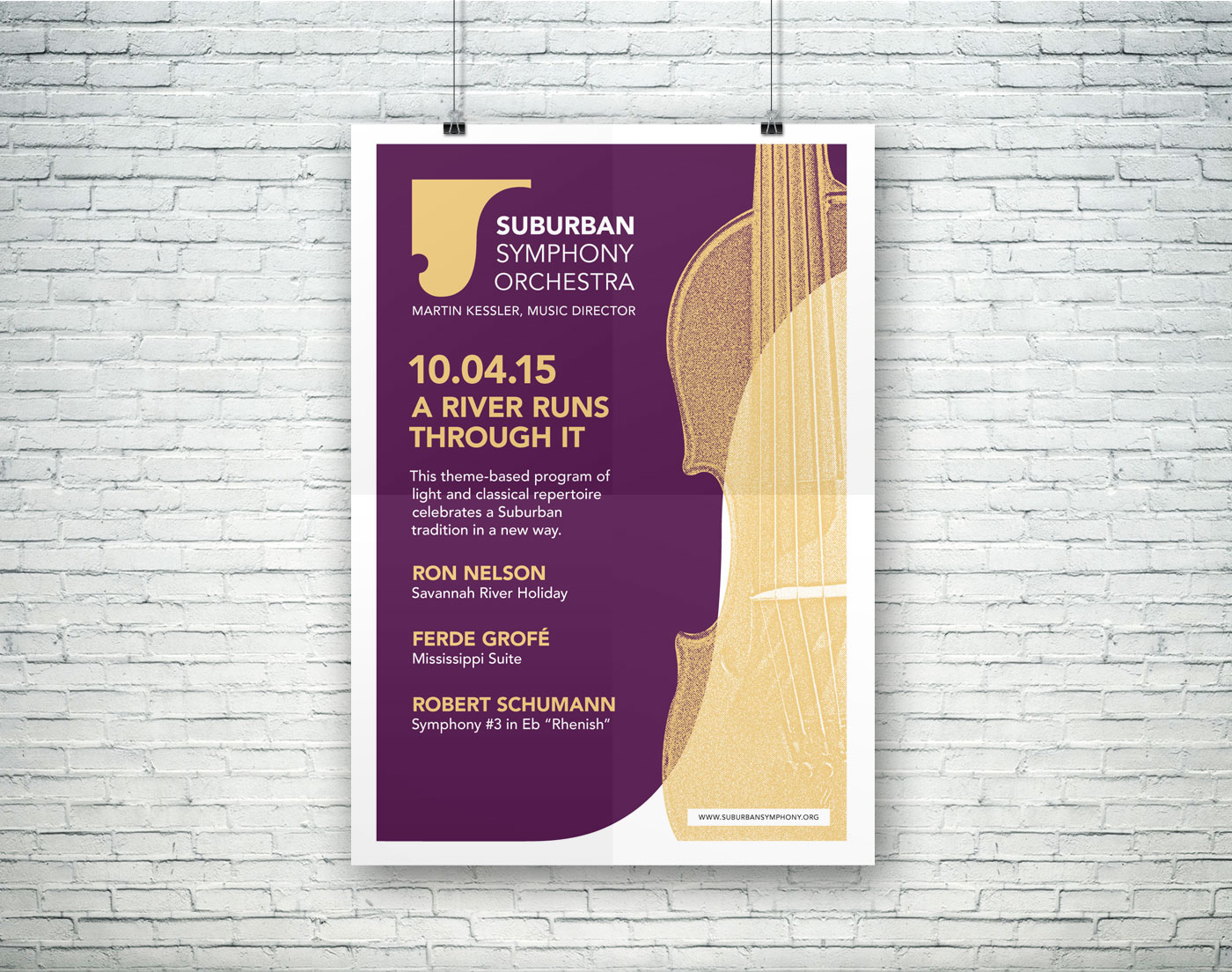
The curved shapes used in the logo design represented not only the “S” in the company title, but also the shapes found often in classical instruments. The elegant shape of the symbol works well as a design element for their print marketing collateral and stationary.


